Choosing colors for your home sounds fun until you are standing in front of hundreds of paint swatches, holding fabric samples, and trying to remember what your sofa looks like at noon. A good color palette is not about finding one perfect shade. It is about building a small family of colors that work together from room to room, in your light, with your furniture, and in the mood you want to live with every day.
The process becomes much easier when you slow down and make decisions in order. Start with what already exists, learn how light changes color, choose a few anchor shades, and test before you commit. This guide will help you create a palette that feels personal, flexible, and calm rather than accidental.
Start With What Is Already in the Room
Most homes are not blank boxes. Floors, kitchen cabinets, bathroom tile, stone counters, brick, and large furniture already bring color into the space. Begin by noticing whether those fixed elements feel warm or cool. Honey-colored wood, beige tile, and cream counters usually lean warm. Gray flooring, chrome, marble with blue veins, and black metal often lean cool.
Your palette should respect those undertones instead of fighting them. If your floor is warm oak, a icy blue-gray wall may look dull beside it, while a warm white or soft sage feels natural. If you have cool gray tile, a muddy yellow-beige may clash. Take photos of your rooms in daylight and look at them together. The fixed colors are your starting clues, not obstacles.
Use a Favorite Piece as a Shortcut
A rug, artwork, cushion, curtain, or even a favorite shirt can reveal colors you already love. Pull three shades from that piece: one light, one medium, and one deeper accent. This shortcut works because the piece already pleases your eye. It can become the thread that connects a room without making everything match too perfectly.
Understand Light Before Choosing Paint
The same color can look soft in one room and harsh in another. North-facing rooms receive cooler, steadier light and can make colors look bluer or grayer. South-facing rooms are brighter and warmer, so colors may appear more intense. East-facing rooms glow in the morning and cool down later. West-facing rooms often become golden in the afternoon.
That is why a paint color from a photo cannot simply be copied. Always test large samples on more than one wall and look at them in morning, afternoon, and evening light. Live with the samples for at least a full day. Notice how they sit beside your floor, sofa, and curtains. The best color is not the prettiest swatch in the store; it is the one that behaves well in your actual room.
Pay Attention to Undertones
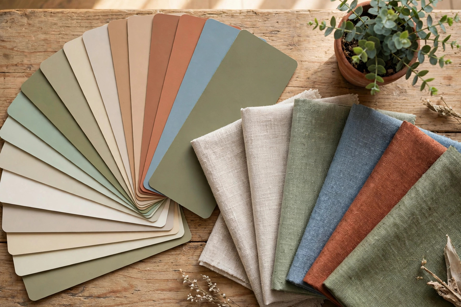
Undertones are the hidden colors beneath the surface. White may lean yellow, pink, gray, or blue. Gray may have green or violet beneath it. Beige may look calm on a card and orange on the wall. Compare swatches against pure white paper and beside your fixed finishes. If two colors are meant to live together, their undertones should feel like relatives, not strangers.
Build a Simple Whole-Home Palette
A whole-home palette usually needs five parts: a main neutral, a secondary neutral, one or two supporting colors, a deeper grounding shade, and a small energetic accent. The neutrals cover walls and large pieces, supporting colors appear in rugs and art, and the accent shows up in pillows, books, or one chair.
A balanced formula many beginners like is 60-30-10. About sixty percent of the room is the dominant color, thirty percent is secondary, and ten percent is accent. Do not measure this like a science project. Use it as a reminder that accent colors are powerful in small doses, while the background should stay calmer.
Choose Colors Room by Room, Not Wall by Wall
It is tempting to give every room a completely different color, but too many unrelated colors can make a home feel chopped up. Instead, let one or two colors travel. The blue in your living room cushions might reappear as towels in the bathroom. The warm white on the walls can continue into the hallway. A bedroom can be deeper and quieter, while a kitchen stays brighter, yet they still belong to the same family.
Think about mood as you move through the home. Living rooms often handle cheerful, welcoming color well. Bedrooms benefit from softer, restful shades. Bathrooms can be fresh and light, while offices need focus-friendly color. The palette stays connected, but each room gets its own emphasis.
Use Doors, Trim, and Furniture to Repeat Color
Color does not only come from paint. Repeating a shade in a door, bookcase, cabinet, headboard, or dining chairs can make the palette feel designed. Soft black or deep green on a small piece of furniture can ground a light room. Warm wood repeated across rooms adds connection even when wall colors change slightly.
Test, Edit, and Live With It
Before painting a whole room, test your palette together. Lay paint samples beside fabric, flooring, wood, and metal finishes. Remove anything that suddenly looks dirty, too bright, or unrelated. A color that fights the rest of the palette usually reveals itself quickly in a group.
Begin with one room if you feel unsure. Paint, live in it for a week, and notice how it feels at the times you use it most. Small adjustments are normal. Maybe the accent needs to be softer, or the room needs one deep color to stop it floating away. Good palettes are edited, not guessed in one afternoon. Keep leftover paint names and sample cards in one folder so future rooms stay consistent.
Frequently Asked Questions
How many colors should be in a home color palette?
Most homes work well with five to seven colors total, including neutrals, wood tones, and metals. You do not need to use every color in every room. A smaller palette is easier to keep calm and connected.
Should all rooms in my home be the same color?
No. They should feel related, not identical. Repeat a few key colors in different amounts so each room has its own mood while the home still flows from space to space.
What is the safest wall color if I am unsure?
A warm, light neutral is usually the safest starting point because it works with many floors and fabrics. Still test it in your light. Even neutrals can look pink, yellow, or gray depending on the room.
How do I add color if I rent or cannot paint?
Use rugs, curtains, bedding, art, cushions, lamps, and plants to build the palette. Large textiles can change the feeling of a room almost as much as paint, and they move with you when you leave.
A beautiful color palette is really a set of kind decisions for your future self. It makes shopping easier, decorating calmer, and your home more coherent. Start with what you have, respect the light, test honestly, and repeat colors with intention. Your rooms will begin to feel connected, personal, and easy to love.